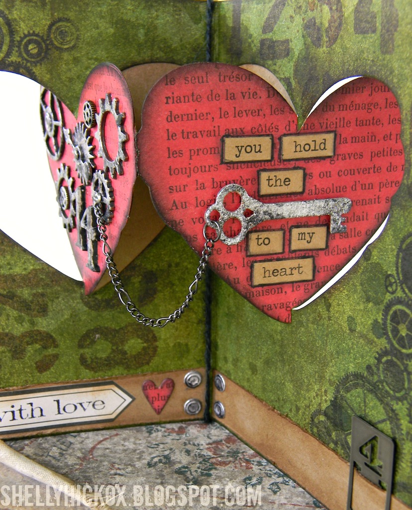
Lately I've been trying to make more time for experimenting in my studio. This Pop it Ups tag is the result of a whole bunch of 'what ifs' - my favorite kind of project!
Experiment #1: I have been dying to try Wendy Vecchi's Archival ink technique. Even though I didn't have the reinkers, I thought it might work with the regular ink pads. While I was playing with it, I also decided to see what it would do on a manila tag (Experiment #2). While it's less flowy and watercolor-y, I think it is still a really great look. Success!
Next, Experiment #3: would it be possible to do an image transfer with Tim Holtz's new Found Relatives cards? As you can see, that is a definite 'yes'!
Experiment #4 was seeing how well the new Lots of Pops die from Karen Burniston would work on a pop-up tag. I've done a few in the past and I love the idea, but would this new die work? Oh....yes!! Which led to Experiment #5 - could I extend the length of the banner poles to make them taller? Another big yes!
Now, take a few minutes to watch the amazing Ms. Vecchi doing her thing. Since I don't have her reinkers yet (I just ordered them!), I just smooshed my ink pads onto my craft sheet and then added alcohol and silver ink. While I did try the technique on Ranger's Specialty Stamping paper, I also tried it on a few tags to see how it would look, and that's what I ended up using for this project.
Once your tag is done, it's time to try transferring one of the Found Relatives images onto it. This is pretty much how you'd do any image transfer, with just a few tweaks. Here's how I did it:
Begin by separating the top layer from the rest of the card. You can easily do this by bending one of the corners and fraying the edge until it separates. Tear around the image. An irregular edge helps the image to blend into the tag.
Apply a thin coat of Multi-Medium to the face of the image, covering the entire piece (I took my photo before the medium was completely spread out).
Place image face down onto your tag and smooth to adhere. I used a brayer to make sure it was completely bonded with the tag, plus it helped remove the excess glue. Let dry completely.
When the image is totally dry, dampen the paper backing with a water-filled mister. Using your fingers, begin rubbing away the paper to reveal the image. If the paper isn't coming off easily, wet a bit more. Continue rubbing until all the paper is removed.
Here is where it's a bit different than a normal image transfer. While you're rubbing off the paper, you'll suddenly see a lot of gooey stuff that looks like white paint. At first I thought it was glue and I hadn't let it dry enough! I set it aside to dry, just in case. When I rewet it, the 'paint' stuff reappeared.
Figuring I didn't have anything to lose, I started wiping it away with a baby wipe. Even after wiping quite a bit, I was left with what you see above. Again, figuring I might as well try to salvage it (I thought it was a failure at this point), I kept rubbing, this time with quite a bit of elbow grease!
After a bit, the image started becoming more and more clear. I took special care around the face, just to make sure I didn't accidentally rub it off!
After all the hazy stuff was rubbed away, this is what the image looked like. Very cool, right?! Because of the coating on the card, the image ends up being very strong and a little glossy. I thought the bubbling effect looked great too. When it was dry, I applied more ink to help blend the image even more, and to make the colors a bit more intense.
I trimmed the tag down so that it would fit on the front of the tag. I added Remnant Rubs, and stamped images using StazOn ink.
I wanted to add one of Tim's Mirrored Stars, but I wanted to give it an aged look. Lightly sanding the back toned down the shininess and made it look very vintage. Love that look! The little faux rivets are some I had left over from
this project.
Since a tag is so much longer than a card, I wanted to see if I could elongate the banner poles so that they'd reach a little higher. By lining up the cutting pads about 1/16" from the bottom of the die, you'll end up with a pole that is cut through, leaving the bottom uncut.
On the right you can see how the pole will look. Now, you can choose how long you'd like it to be and use your scissors or trimmer to cut the sides.
The pop-up tag was created just like I did in
THIS tutorial,
using Tim Holtz's Tag die. The Lots of Pops mechanism was cut out of
decorative paper, trimmed down, and adhered inside the folded tag. I used a scrap from another tag to stamp the cupcake image on and used one of the frames from Karen's Accordion Fancy Label set to cut it out. The little banners were cut using a die that is part of the Lots of Pops set (you get SO many dies!!). I added Label Letters to spell out Dad and strung them between the poles with Tim's new Jute String.
I hope you enjoyed this crazy long post! I apologize for the lack of stepped-out pics on the inside - I got carried away and totally forgot to take them. I hope you try the transfer technique, Wendy's ink technique, and some of Karen's fantastic dies. More than anything, I love combining all of my favorite things into something for one of my favorite people...that's what this is all about, right? :)
Everything I used can be found at Inspiration Emporium via the links below. Remember to use my coupon code - stamptramp - to save 10% on your order. They also offer some of the cheapest shipping around!
Remember too, that
IE has a challenge going on right now. This month we want you to 'Show it With Words'. Hope you can join in with us. You could win a $50 gift certificate!